If you’ve never heard of “getting your colours done”, colour analysis is a method used to determine which shades and tones best complement your natural features and which colours are the most flattering for you, based on natural features like your eye colour, skin tone, and hair colour. Results are usually categorized by season (spring, summer, autumn, or winter), then more specifically by contrast (low to high), undertone (cool, warm, or neutral), value (light to dark), and saturation (soft to bright).
The idea is that wearing the right colours can make you look more vibrant, while the wrong ones can supposedly make you look washed out or dull.
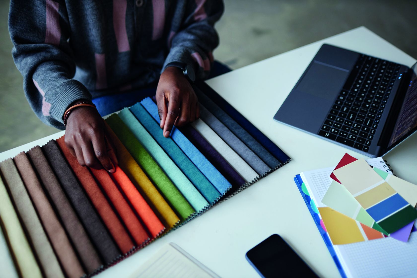
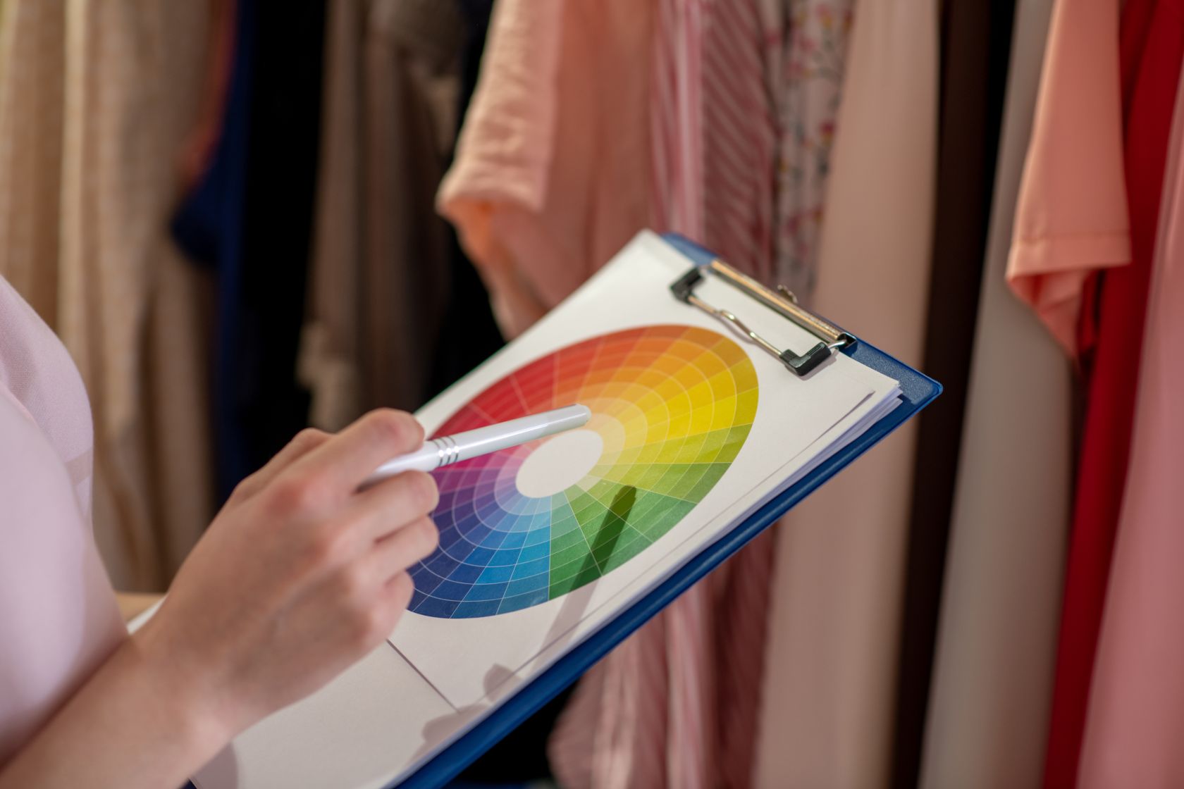
In personal styling, identifying the specific colour palette can elevate a look from ordinary to extraordinary.
I think everybody has their favourite colours, or colours they like to wear, and that’s completely natural. But recently I’ve seen a lot of content on social media about professional colour analysis. The best way to get accurate results is to visit a specialist, but if you are curious, you can also try to figure it out yourself. The internet is full of excellent resources on colour theories, just try Googling terms like “colour theory” or watching “What season am I?” videos on YouTube to get started.
The four basic seasons
There are different systems, but the most common one categorises people into four seasons — Spring, Summer, Autumn, and Winter — each with its own subcategories.
Spring: warm, bright colours (e.g. apple green, coral, turquoise, narcissus yellow)
Summer: cool, light colours (e.g. sea blue, light blue, lilac, soft pink)
Autumn: warm, dark colours (e.g. pumpkin orange, brown, wine red, bottle green)
Winter: cold, dark colours (e.g. icy white, dark blue, ruby red, violet and blue)
Each season offers a wide range of shades that can be used to create customised and flattering looks.

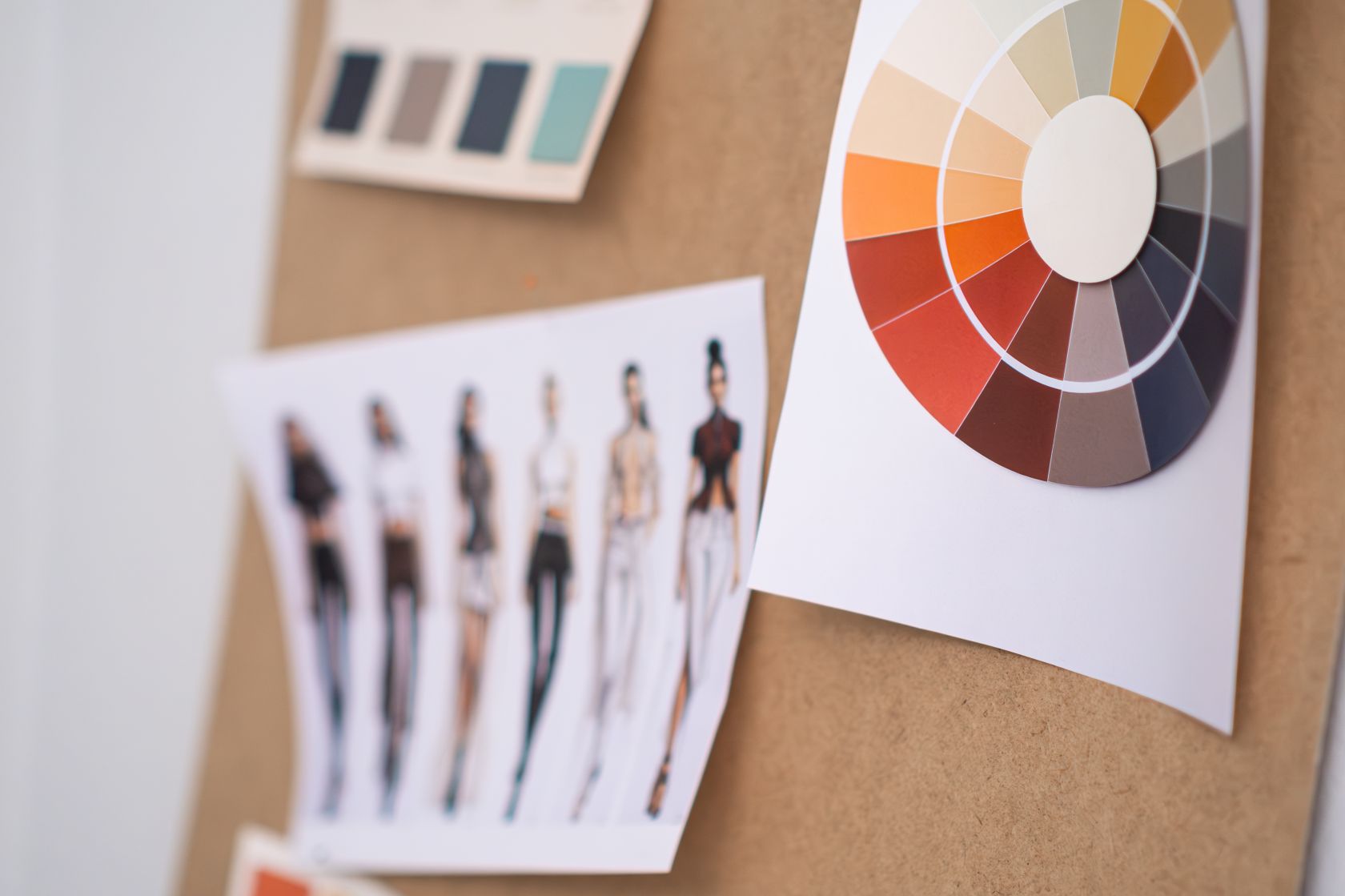
Learning to see colour like a Stylist
When looking at a colour, think about what characteristics that colour has. The colour purple, for example, is unique and exotic, usually associated with wisdom and ambition. But when you think about lavender purple, it’s cool and serene, with low to medium saturation, giving it an airy and soft feel. Light purple shades are often favoured by those with cool and soft features, like those in a light summer or cool summer palette. They evoke a feeling of freshness and femininity.
Compared to plum purple, which is warmer (it looks like it has some brown added to it, unlike lavender purple, which is a clearer colour). It’s a sophisticated and mysterious colour, easy to understand why it’s an autumn colour. Deeper, warmer purples can be more flattering for autumn or winter types.
You can also look up a picture of the autumn palette and see if the plum purple looks as it belongs there (it does) and compare it to how out of place it looks in the other seasons. Compare it to the spring palette and see how the autumn deep purple looks so much heavier than the spring colours (Spring colours are fresh, not heavy. Think sorbet vs pumpkin pie).
The 12-season colour system is an expansion of the traditional four-season model and works great for a lot of people, especially those who are not dominated by coolness or warmth.
Colour analyse yourself like a PRO
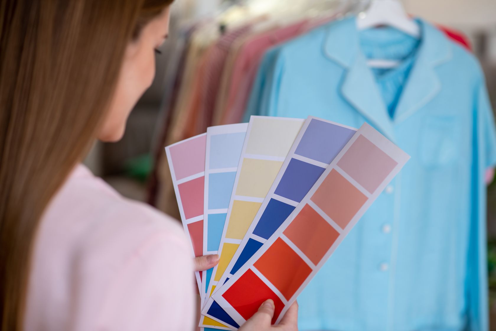
Colour analysis is ideally done with a trained professional who can see how each shade impacts your dark circles, lip colour, eye colour, and overall complexion.
However, if you would like to try it at home, here is a brief introduction:
Stand/sit in front of a mirror, using (indirect) natural daylight as your light source (rather than lamps). Don’t wear any makeup and pull your hair back (it can be a good idea to cover your hair with a neutral white or grey towel/headband/scarf if you have dyed hair).
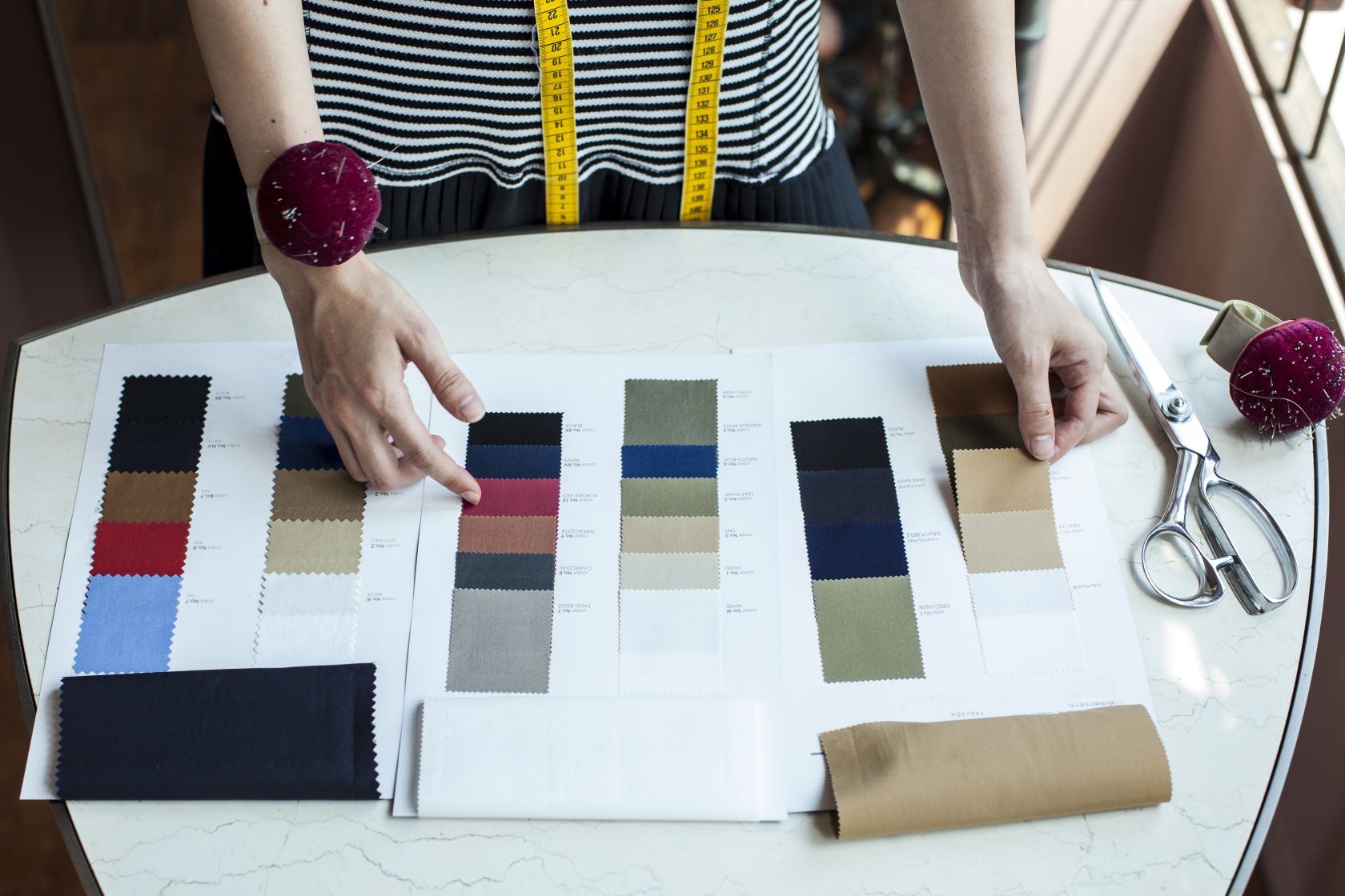
Once you have found or created drapes that represent the four seasons, divide them up into colour groups. (Or simply use fabric swatches or clothes in a variety of colours that represent the seasons.) Colour analysis is all about comparison, so it’s a good idea to compare different seasons’ variation of the same colour (e.g. comparing a winter blue to a summer blue)
After comparing individual colours, you can also compare the seasons by layering several of the drapes from one season around your neck/shoulders at the same time (so you’re wearing more than one drape). This might get a bit tricky, but it can be useful to see the entire seasonal harmony on you in addition to comparing individual drapes across different seasons. A similar effect can be achieved if you have a multicoloured drape.
Keep your eyes fixated on your face as you switch from on season’s colour to the next. Try to observe the changes in your skin and face, and if your eyes stand out, not the colour of the drape. A good tip is to quickly change between one drape and the next - the moment of change can often reveal a lot more than when you look at a drape for longer time and your eyes get used to it. You can also try to close your eyes, put on a new drape and then open your eyes again to see the changes.
Some colours might seem like they could fit more than one season’s characteristics and they’re often described as “universal” colours (this basically means that people across different seasons can pull it off - it might not be their best, but it won’t be horrible). Good example is Navy colour, which is often considered as a versatile and universally flattering colour.
If finding your colours was incredibly easy, we wouldn’t need colour analysis, but the truth is, most people can wear a wide range of colours. It’s not like one palette is good, and then all the others are horrible. Colour analysis tries to find the best one out of the lot. For some, it’s extremely close between two or more seasonal subgroups.
Final thoughts: Use it as a guide, not a rule
Colour is meant to be fun. You don’t need to match everything exactly to your palette. If your outfit is mostly in ‘your’ colours, you’ll be fine (so don’t throw away an item you love just because it’s not your perfect colour). Ask yourself why you drawn to colour analysis and what you hope to gain from it.
The colour analysis test is a process that helps determine a person’s “season” and their most enhancing colour palette. When done by a professional, it provides tailored guidance for clothing and make-up choices.
I believe colour analysis can be a helpful tool when used with balance. It can give you a better idea of what makes you feel confident and put-together. Certain colours do have an impact on how we perceive ourselves. I also know that I feel better in a black or beige than bright colours. So, should we treat our colour season like an unbreakable rule? Absolutely not.
Personal style is personal. If you love a colour, wear it!


Follow us on social media