A lot has been written in posh home decor magazines about colour co-ordination, and they offer page after page of glossy pictures of neutral or accent-coloured rooms with just the right amount of furniture, just enough pictures, just enough cushions and perfect lighting. And of course, strategically placed plants or vases of flowers.
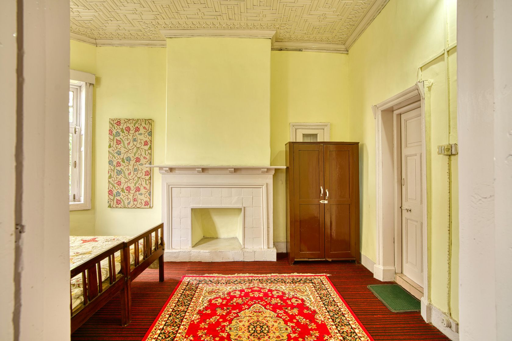
But we all know that unless you have gazillions of money, your rooms are nowhere in hell going to look so charming. We all have mismatched furniture, whether it be style or colour, family pictures on the walls and not designer pieces, and there is always a dark corner that needs a lamp, but you never got round to it – and that’s where the dust bunnies gather, of course.
They say Colour Coordination Matters
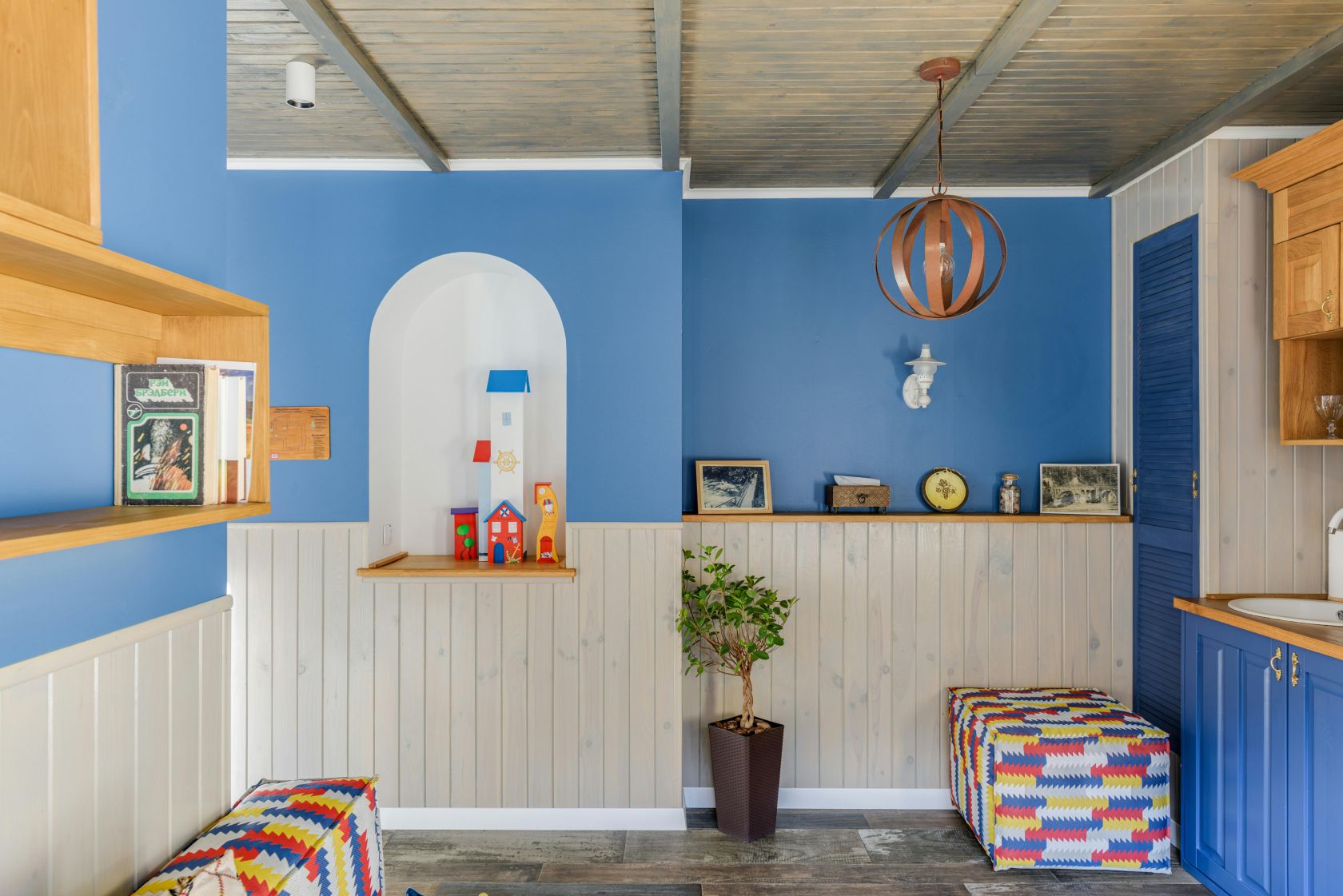
Colours that complement each other using the 60-30-10 rule help unite different elements, making your space feel purposeful and balanced – this ‘rule’ meaning: 60% dominant colour, 30% secondary colour and 10% highlight or accent colour. Coordinated colours, even if they aren’t exact matches, take a look from ‘okay’ to ‘fantastic’ and suggest you have paid attention to detail! And they say colours influence moods—warm colours (reds, yellows) bring energy, while cool colours (blues, greens) promote relaxation.
Do I care that my stuff doesn’t match?
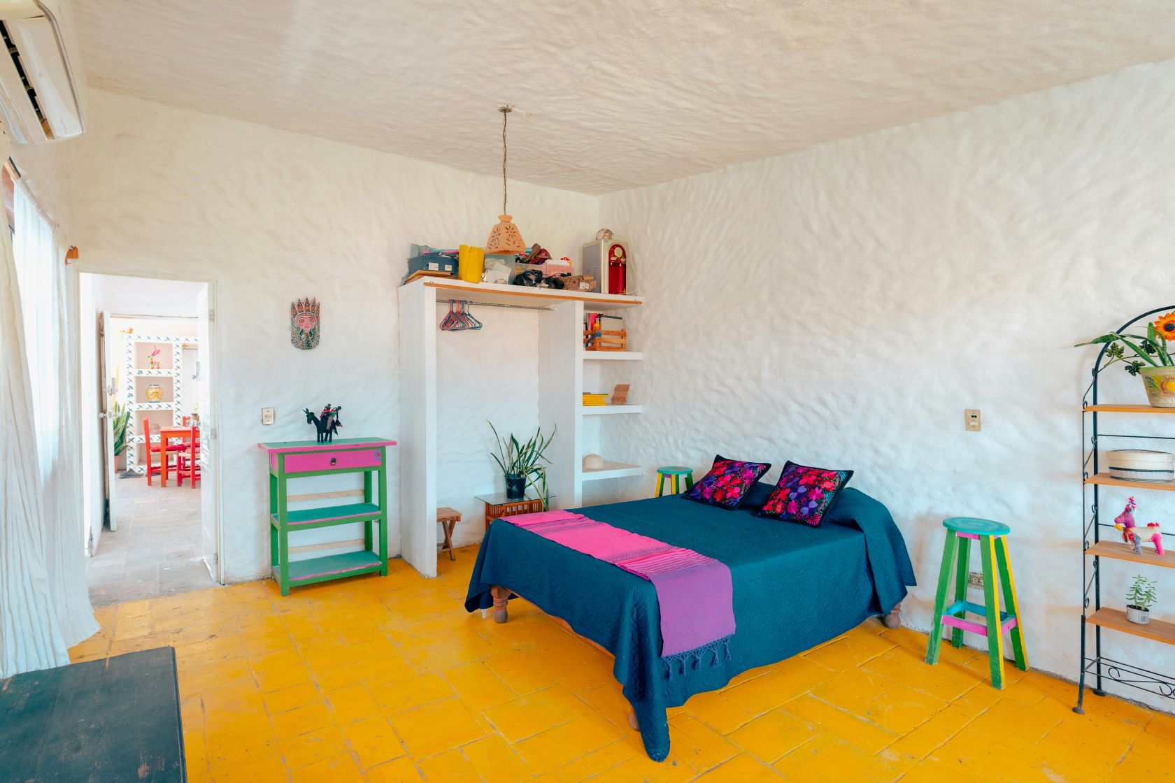
Well, you do not need to care that your furnishings are, say, mismatched green and yellow. (In fact, green and yellow are widely regarded as cheerful, a natural combination often used to bring energy into a room!). Mismatched or ‘collected’ furniture is often considered more stylish than perfectly matched sets because it adds personality to a space.
But making a room look colour-cohesive or ‘pulled together’ isn’t that difficult, and with a basic colour theme, you can add to it through repetition, balance, and limiting the palette, rather than relying on complex design rules. The easiest way to achieve this is to create a palette of 3–5 hues and repeat them in different shades and proportions throughout your space. Go back to the 60-30-10 rule or select a ‘thread’ of colour and weave it through the room, maybe with a blanket throw in the chosen colour, or a picture with the same colour to give a matched look.
And it’s said to avoid the ‘Matchy-Matchy’ look. If you are using, say, green, things don’t have to be an exact match, so vary the colour range - a combination of dark green cushions and a light olive throw, or vice versa, would do nicely for a coordinated look.
If you have a neutral colour theme and perhaps have a mismatched grey chair and a cream sofa, you can add matching cushions or throws of your secondary colour to pull them together and tone down the differences.
And don’t forget lighting
Layer your lighting by combining different sources to create depth, warmth, and purpose. Experts recommend having 2-3 light sources per room—specifically a mix of ambient (general), task (focused), and accent (decorative) lighting. Use ‘warm’ coloured light bulbs to avoid making your room look like an operating room, and mix table lamps, floor lamps, and ceiling fixtures so the light is not all coming from one spot. And of course, mirrors on the walls can amplify existing light, so one opposite your window will let more natural light in and ultimately bring your outside colours indoors.


Follow us on social media